A pitched contribution for Dansk Magazine,
in layout.
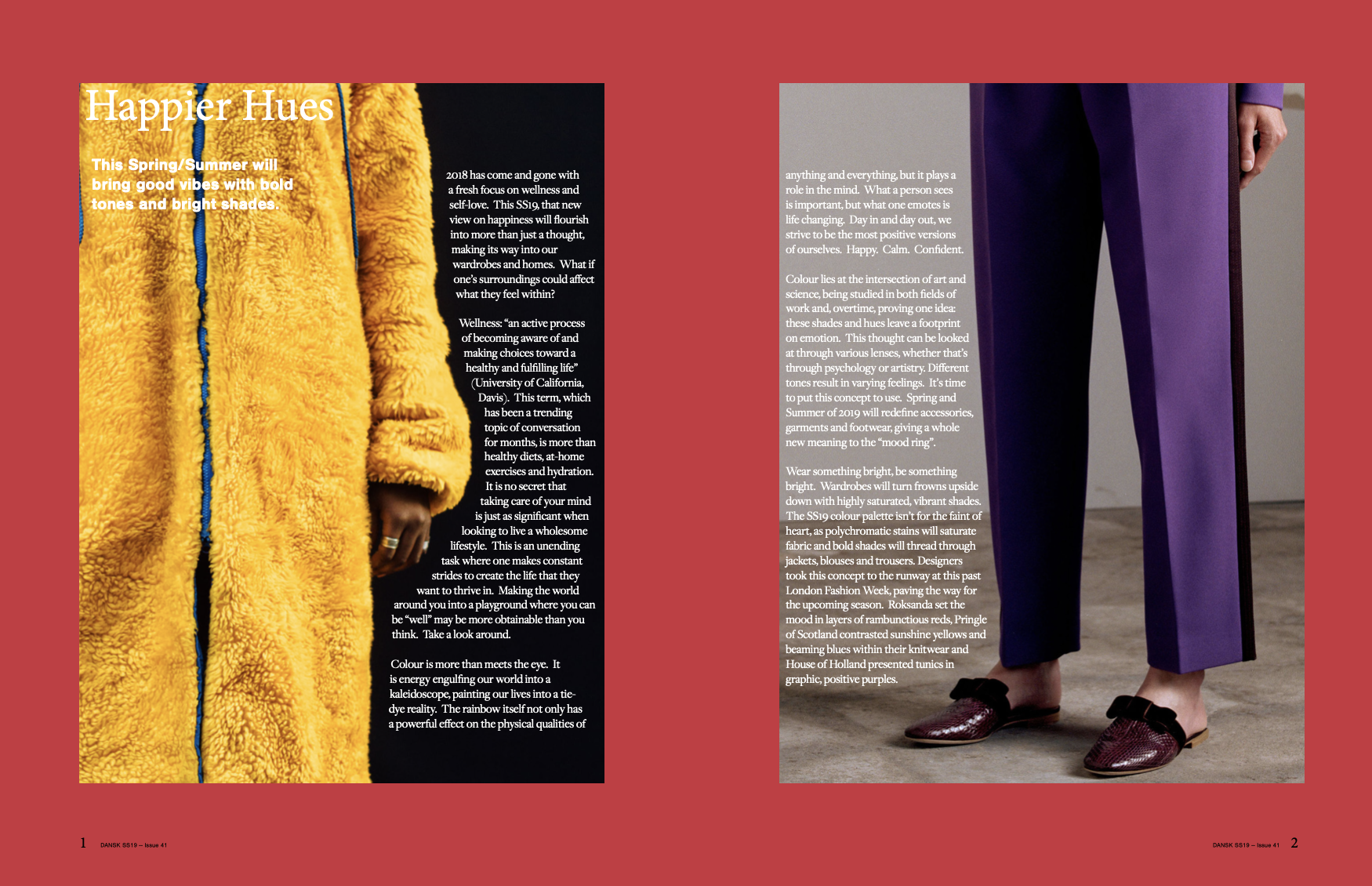
Happier hues
By Allison Strang
This Spring/Summer will bring good vibes with bold tones and bright shades.
2018 has come and gone with a fresh focus on wellness and self-love. This SS19, that new view on happiness will flourish into more than just a thought, making its way into our wardrobes and homes. What if one’s surroundings could affect what they feel within?
Wellness: “an active process of becoming aware of and making choices toward a healthy and fulfilling life” (University of California, Davis). This term, which has been a trending topic of conversation for months, is more than healthy diets, at-home exercises and hydration. It is no secret that taking care of your mind is just as significant when looking to live a wholesome lifestyle. This is an unending task where one makes constant strides to create the life that they want to thrive in. Making the world around you into a playground where you can be “well” may be more obtainable than you think. Take a look around.
Colour is more than meets the eye. It is energy engulfing our world into a kaleidoscope, painting our lives into a tie-dye reality. The rainbow itself not only has a powerful effect on the physical qualities of anything and everything, but it plays a role in the mind. What a person sees is important, but what one emotes is life changing. Day in and day out, we strive to be the most positive versions of ourselves. Happy. Calm. Confident.
Colour lies at the intersection of art and science, being studied in both fields of work and, overtime, proving one idea: these shades and hues leave a footprint on emotion. This thought can be looked at through various lenses, whether that’s through psychology or artistry. Different tones result in varying feelings. It’s time to put this concept to use. Spring and Summer of 2019 will redefine accessories, garments and footwear, giving a whole new meaning to the “mood ring”.
Wear something bright, be something bright. Wardrobes will turn frowns upside down with highly saturated, vibrant shades. The SS19 colour palette isn’t for the faint of heart, as polychromatic stains will saturate fabric and bold shades will thread through jackets, blouses and trousers. Designers took this concept to the runway at this past London Fashion Week, paving the way for the upcoming season. Roksanda set the mood in layers of rambunctious reds, Pringle of Scotland contrasted sunshine yellows and beaming blues within their knitwear and House of Holland presented tunics in graphic, positive purples.
No matter the occasion, time or place, this season will bring in good vibes with lively hues. Dull tints of black and white have bored workwear for far too long. Pantsuits will stroll throughout the office with colours of confidence: daffodil yellows and geranium pinks. Eveningwear will take a turn. From playing it safe in the classic shades of silver to being elegant with optimism in magnetic blue, gowns will glow, transforming from monochrome to multi-coloured. Day to day, the body will be surrounded in all-things vibrant.
Interior design will follow a similar suit, completing the bright-coloured vibe. Accent walls of orange, fuchsia or emerald will bring rooms a bit of optimism. Multi-toned décor, cushions and throws will exclaim “get well”, transforming traditionally neutral shades in the home. Enveloping the body, quite literally, in these high-contrast hues will boost moods, giving one a technicolour livelihood.
Spring and summer won’t just be a season, but an active aspect of wellness. As mental wellbeing is a huge part of one’s overall health, it is vital to see how the colours of clothing and of our surroundings directly play a role in psychology, leaving a huge impact on SS19. Chromotherapy, which involves the use of colours to heal, has been practiced since ancient times, so applying these tactics to what is worn on the body and placed in homes will be influential beyond the commercial industry. This trend isn’t a matter of aesthetics, but of wholeness. With red comes power, blue exudes stability and yellow radiates energy. Injecting these shades into everyday life can redirect style into more than a physical perception. GraphicDesign& co-founder and University for the Creative Arts lecturer, David Shaw stated “I think colour is a great way of reminding you that, beyond the human and nature, there is so much joy to be had... Have it next to you and near you.” Suddenly, fashion and interior design seems more than skin deep.
In the year 1961, Swiss artist and theorist Johannes Itten shared that “Colours are forces, radiant energies that affect us positively or negatively, whether we are aware of it or not.” Between creativity, design, psychology and science, colour has proven to be more than what is on the surface. With research of the past, motives of the present and healthy goals of the future, a positive colour palette is on its way this Spring/Summer 2019.